![Java SE 11 Programmer II [1Z0-816] Practice Tests](https://static.shareasale.com/image/43514/728X9026.jpg)


![Java SE 11 Developer (Upgrade) [1Z0-817]](https://static.shareasale.com/image/43514/728X9033.jpg)
![Java SE 11 Programmer I [1Z0-815] Practice Tests](https://static.shareasale.com/image/43514/728X909.jpg)
In this article we looking at creating pie charts in python using matplotlib
Pie Chart
matplotlib.pyplot.pie(x, explode=None, labels=None, colors=None, autopct=None, pctdistance=0.6, shadow=False, labeldistance=1.1, startangle=None, radius=None, counterclock=True, wedgeprops=None, textprops=None, center=(0, 0), frame=False, rotatelabels=False, *, data=None)
Make a pie chart of array x. The fractional area of each wedge is given by x/sum(x). If sum(x) < 1, then the values of x give the fractional area directly and the array will not be normalized. The resulting pie will have an empty wedge of size 1 - sum(x).
The wedges are plotted counterclockwise, by default starting from the x-axis.
| Parameters: |
|
|---|
We will cover a few of the parameters in the following examples
Examples
Basic example
Here is a basic example which will create a basic pie chart
import matplotlib.pyplot as plot

x = [30, 9, 52, 12, 24]
y = ['Apples', 'Pears', 'Oranges', 'Lemons', 'Limes']

plot.pie(x, labels = y)

plot.show()
This will display the following
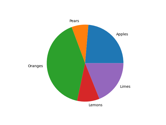
pie chart example
matplotlib Pie Chart title
The Python pyplot has a title method, which helps to assign a title or heading for the pie chart.
Let see an example
import matplotlib.pyplot as plot

x = [30, 9, 52, 12, 24]
y = ['Apples', 'Pears', 'Oranges', 'Lemons', 'Limes']

plot.pie(x, labels = y)
plot.title("Fruit popularity",
     color = 'blue', fontweight = 'bold', fontsize = '16')
plot.show()
Which will give you a pie chart like this
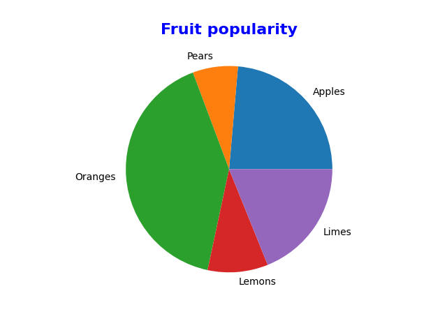
pie chart example with title
matplotlib Pie chart colors
We can change the colors of the wedges as well by using the Python colors argument to assign our own to each wedge.
import matplotlib.pyplot as plot

x = [30, 9, 52, 12, 24]
y = ['Apples', 'Pears', 'Oranges', 'Lemons', 'Limes']
color_list = ['red', 'green', 'blue', 'yellow', 'cyan']

plot.pie(x, labels = y, colors = color_list)
plot.title("Fruit popularity",
     color = 'blue', fontweight = 'bold', fontsize = '16')
plot.show()
This is what i saw
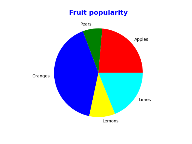
pie chart example colors
matplotlib Pie chart percentages
The autopct argument shows the percentage of each wedge. You can use the string format to vary the display of percentage values. For example, %1.2f%% will return value 15.24%, and .1f% returns 15.2%.
import matplotlib.pyplot as plot

x = [30, 9, 52, 12, 24]
y = ['Apples', 'Pears', 'Oranges', 'Lemons', 'Limes']
color_list = ['red', 'green', 'blue', 'yellow', 'cyan']

plot.pie(x, labels = y, colors = color_list, autopct = '%1.1f%%')
plot.title("Fruit popularity",
     color = 'blue', fontweight = 'bold', fontsize = '16')
plot.show()
This displayed the following pie chart
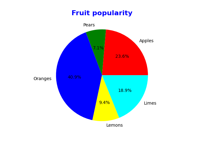
pie chart example percentages
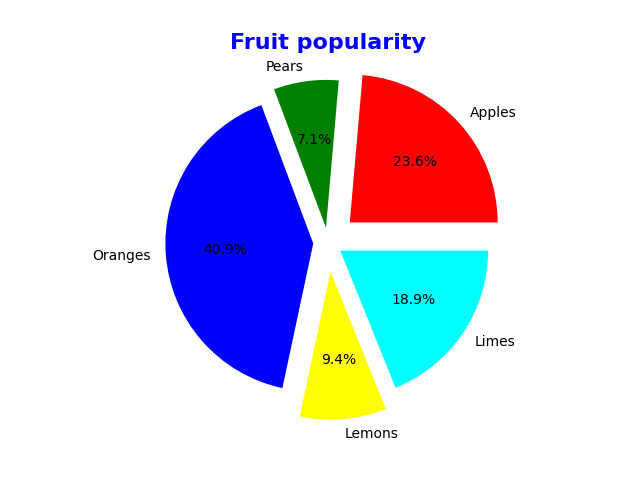
matplotlib Pie chart Slice out
The explode argument in pyplot pie decides which part should explode. This argument accepts a tuple of numeric values, and each non-zero value represents the distance of that slice from the center.
import matplotlib.pyplot as plot

x = [30, 9, 52, 12, 24]
y = ['Apples', 'Pears', 'Oranges', 'Lemons', 'Limes']
color_list = ['red', 'green', 'blue', 'yellow', 'cyan']
explode_value = (0.2, 0.1, 0.1, 0.2, 0.1)

plot.pie(x, labels = y, colors = color_list, autopct = '%1.1f%%', explode = explode_value)
plot.title("Fruit popularity",
     color = 'blue', fontweight = 'bold', fontsize = '16')
plot.show()
This gave the following pie chart
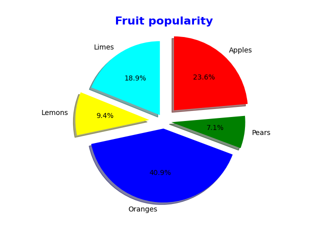
matplotlib Rotating Python pie chart
The startangle argument in the pie function allows choosing the chart starting position. It means you can rotate the pie chart based on the angle of degrees you provided.
In this example, we are using 180 degrees so that the chart start position will start at 180 degrees. Next, we used the shadow argument and assigned True value to it, so a shadow will be displayed on the pie chart.
There is another argument called counterclock. It means the pie chart will draw in counterclockwise but we will set this to false rather than the default of true, lets see all of this.
import matplotlib.pyplot as plot

x = [30, 9, 52, 12, 24]
y = ['Apples', 'Pears', 'Oranges', 'Lemons', 'Limes']
color_list = ['red', 'green', 'blue', 'yellow', 'cyan']
explode_value = (0.2, 0.1, 0.1, 0.2, 0.1)

plot.pie(x, labels = y, colors = color_list, autopct = '%1.1f%%',
    explode = explode_value,
    shadow = True,
    startangle = 90,
    counterclock = False)

plot.title("Fruit popularity",
     color = 'blue', fontweight = 'bold', fontsize = '16')

plot.show()
This gave me the following pie chart