![Java SE 11 Programmer II [1Z0-816] Practice Tests](https://static.shareasale.com/image/43514/728X9026.jpg)
![Java SE 11 Programmer I [1Z0-815] Practice Tests](https://static.shareasale.com/image/43514/728X909.jpg)


![Java SE 11 Developer (Upgrade) [1Z0-817]](https://static.shareasale.com/image/43514/728X9033.jpg)
In this article we will show you how to create scatter charts in Python using matplotlib
Syntax
matplotlib.pyplot.scatter(x, y, s=None, c=None, marker=None, cmap=None, norm=None, vmin=None, vmax=None, alpha=None, linewidths=None, *, edgecolors=None, plotnonfinite=False, data=None, **kwargs)
parameters:
- x_axis_data- An array containing x-axis data
- y_axis_data- An array containing y-axis data
- s- marker size (can be scalar or array of size equal to size of x or y)
- c- color of sequence of colors for markers
- marker– marker style, marker can be either an instance of the class or the text shorthand for a particular marker.
- cmap- A
Colormapinstance or registered colormap name. cmap is only used if c is an array of floats. - linewidths- The linewidth of the marker edges. Note: The default edgecolors is ‘face'. You may want to change this as well.
- edgecolor- The edge color of the marker.
- alpha- The alpha blending value, between 0 (transparent) and 1 (opaque).
Examples
basic example
In this example we take some hypothetical golf scores and the number of players who got that score and plot them.
Lets see this in action
import matplotlib.pyplot as plot
import numpy as np

x = np.array([5,7,8,7,2,9,7,9,4,9,12,9,6])
y = np.array([65,66,67,68,69,70,71,72,73,74,75,76,77])

plot.scatter(x, y)
plot.show()
This displayed the following
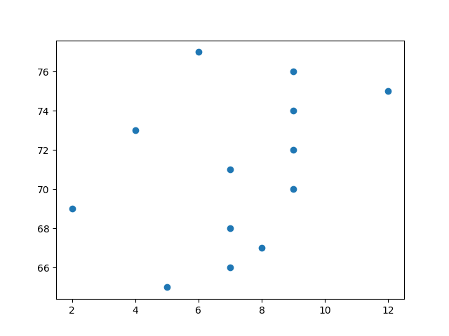
scatter basic
matplotlib Scatter chart titles
In this matplotlib scatter plot example, we used the xlabel, ylabel, and title functions to show X-Axis, Y-Axis labels, and chart titles.
import matplotlib.pyplot as plot
import numpy as np

x = np.array([5,7,8,7,2,9,7,9,4,9,12,9,6])
y = np.array([65,66,67,68,69,70,71,72,73,74,75,76,77])

plot.title('Golf Scores')
plot.xlabel('Players')
plot.ylabel('Score')

plot.scatter(x, y)
plot.show()
This will display the following
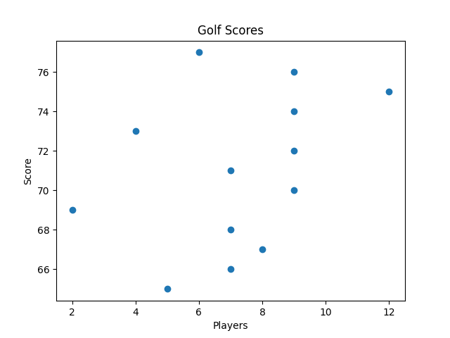
scatter chart titles
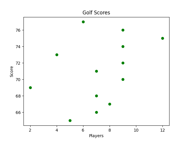
matplotlib Scatter chart colors
You can set your own color for each scatter plot with the color or the c argument
Here is an example
import matplotlib.pyplot as plot
import numpy as np

x = np.array([5,7,8,7,2,9,7,9,4,9,12,9,6])
y = np.array([65,66,67,68,69,70,71,72,73,74,75,76,77])

plot.title('Golf Scores')
plot.xlabel('Players')
plot.ylabel('Score')
plot.scatter(x, y, color = 'green')
plot.show()
You will see this
matplotlib Scatter chart Color Each Dot
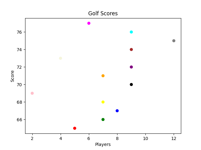
You can even set a specific color for each dot by using an array of colors as value for the c argument
Here is an example
import matplotlib.pyplot as plot
import numpy as np

x = np.array([5,7,8,7,2,9,7,9,4,9,12,9,6])
y = np.array([65,66,67,68,69,70,71,72,73,74,75,76,77])
colors = np.array(["red","green","blue","yellow","pink","black","orange","purple","beige","brown","gray","cyan","magenta"])

plot.title('Golf Scores')
plot.xlabel('Players')
plot.ylabel('Score')
plot.scatter(x, y, c=colors)
plot.show()
This displays the following
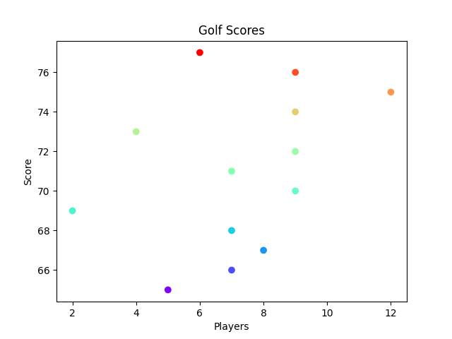
matplotlib Scatter chart using a colormap
We can use a colormap. A colormap is basically a list of colors, where each color has a value that ranges from 0 to 100.
Here is an example
import matplotlib.pyplot as plot
import numpy as np

x = np.array([5,7,8,7,2,9,7,9,4,9,12,9,6])
y = np.array([65,66,67,68,69,70,71,72,73,74,75,76,77])
colors = np.array([0, 10, 20, 30, 40, 45, 50, 55, 60, 70, 80, 90, 100])

plot.title('Golf Scores')
plot.xlabel('Players')
plot.ylabel('Score')
plot.scatter(x, y, c=colors, cmap='rainbow')
plot.show()
This displayed the following
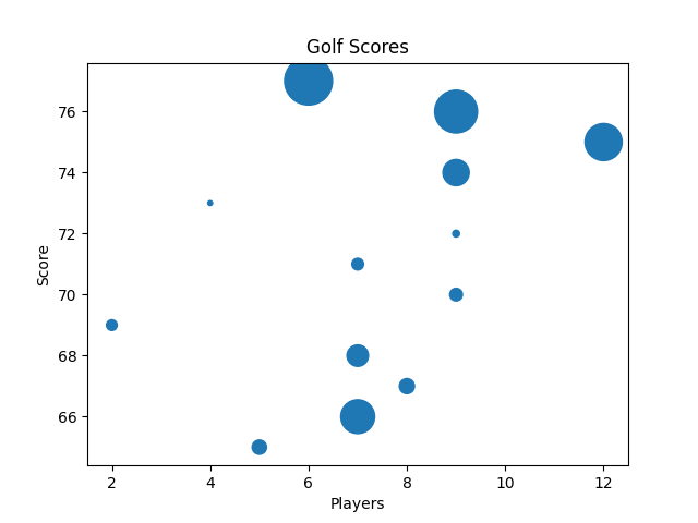
Changing the size of the dots
You can change the size of the dots with the s argument.
You need to make sure the array for sizes has the same length as the arrays for the x- and y-axis
Here is an example
import matplotlib.pyplot as plot
import numpy as np

x = np.array([5,7,8,7,2,9,7,9,4,9,12,9,6])
y = np.array([65,66,67,68,69,70,71,72,73,74,75,76,77])
sizes = np.array([90,500,100,200,50,70,60,20,10,300,600,800,1000])

plot.title('Golf Scores')
plot.xlabel('Players')
plot.ylabel('Score')
plot.scatter(x, y, s=sizes)
plot.show()
This displayed the following
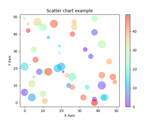
Random colors and sizes
In this example we will now show random colors and examples with random data
import matplotlib.pyplot as plot
import numpy as np

x = np.random.randint(50, size=(50))
y = np.random.randint(50, size=(50))
colors = np.random.randint(50, size=(50))
sizes = 10 * np.random.randint(50, size=(50))

plot.title('Scatter chart example')
plot.xlabel('X Axis')
plot.ylabel('Y Axis')

plot.scatter(x, y, c=colors, s=sizes, alpha=0.5, cmap='rainbow')

plot.colorbar()

plot.show()
This displayed the following