![Java SE 11 Programmer II [1Z0-816] Practice Tests](https://static.shareasale.com/image/43514/728X9026.jpg)


![Java SE 11 Developer (Upgrade) [1Z0-817]](https://static.shareasale.com/image/43514/728X9033.jpg)

![Java SE 11 Programmer I [1Z0-815] Practice Tests](https://static.shareasale.com/image/43514/728X909.jpg)
A violin plot is a method of plotting numeric data. It is similar to a box plot, with the addition of a rotated kernel density plot on each side.
Violin plots are similar to box plots, except that they also show the probability density of the data at different values, usually smoothed by a kernel density estimator. Typically a violin plot will include all the data that is in a box plot: a marker for the median of the data; a box or marker indicating the interquartile range; and possibly all sample points, if the number of samples is not too high.
Syntax
matplotlib.pyplot.violinplot(dataset, positions=None, vert=True, widths=0.5, showmeans=False, showextrema=True, showmedians=False, quantiles=None, points=100, bw_method=None, *, data=None)[source]
Make a violin plot.
Make a violin plot for each column of dataset or each vector in sequence dataset. Each filled area extends to represent the entire data range, with optional lines at the mean, the median, the minimum, the maximum, and user-specified quantiles.
Parameters
- Parameters
-
- datasetArray or a sequence of vectors.
- The input data.
- positionsarray-like, default: [1, 2, …, n]
- The positions of the violins. The ticks and limits are automatically set to match the positions.
- vertbool, default: True.
- If true, creates a vertical violin plot. Otherwise, creates a horizontal violin plot.
- widthsarray-like, default: 0.5
- Either a scalar or a vector that sets the maximal width of each violin. The default is 0.5, which uses about half of the available horizontal space.
- showmeansbool, default: False
- If
True, will toggle rendering of the means. - showextremabool, default: True
- If
True, will toggle rendering of the extrema. - showmediansbool, default: False
- If
True, will toggle rendering of the medians. - quantilesarray-like, default: None
- If not None, set a list of floats in interval [0, 1] for each violin, which stands for the quantiles that will be rendered for that violin.
- pointsint, default: 100
- Defines the number of points to evaluate each of the gaussian kernel density estimations at.
- bw_methodstr, scalar or callable, optional
- The method used to calculate the estimator bandwidth. This can be ‘scott’, ‘silverman’, a scalar constant or a callable. If a scalar, this will be used directly as
kde.factor. If a callable, it should take aGaussianKDEinstance as its only parameter and return a scalar. If None (default), ‘scott’ is used. - dataindexable object, optional
- If given, the following parameters also accept a string
s, which is interpreted asdata[s](unless this raises an exception):dataset
- Returns
-
- dict
- A dictionary mapping each component of the violinplot to a list of the corresponding collection instances created. The dictionary has the following keys:
bodies: A list of thePolyCollectioninstances containing the filled area of each violin.cmeans: ALineCollectioninstance that marks the mean values of each of the violin’s distribution.cmins: ALineCollectioninstance that marks the bottom of each violin’s distribution.cmaxes: ALineCollectioninstance that marks the top of each violin’s distribution.cbars: ALineCollectioninstance that marks the centers of each violin’s distribution.cmedians: ALineCollectioninstance that marks the median values of each of the violin’s distribution.cquantiles: ALineCollectioninstance created to identify the quantile values of each of the violin’s distribution.
Examples
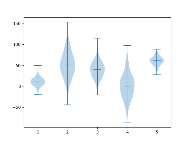
Basic example
import matplotlib.pyplot as plot
import numpy as np

np.random.seed(1)

#creating dataset
data1 = np.random.normal(10, 10, 1000)
data2 = np.random.normal(50, 30, 1000)
data3 = np.random.normal(40, 20, 1000)
data4 = np.random.normal(0, 30, 1000)
data5 = np.random.normal(60, 10, 1000)
data = [data1, data2, data3, data4, data5]

fig, ax = plot.subplots()

#drawing violin plot
ax.violinplot(data, showmedians=True)

plot.show()
This will display the following
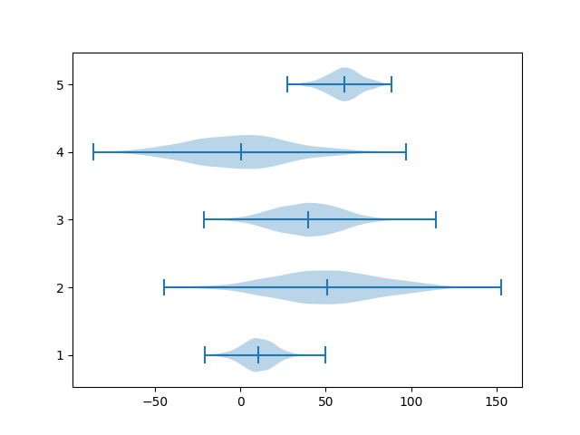
Horizontal example
By using vert parameter, a horizontal violin plot can be created
import matplotlib.pyplot as plot
import numpy as np

np.random.seed(1)

#creating dataset
data1 = np.random.normal(10, 10, 1000)
data2 = np.random.normal(50, 30, 1000)
data3 = np.random.normal(40, 20, 1000)
data4 = np.random.normal(0, 30, 1000)
data5 = np.random.normal(60, 10, 1000)
data = [data1, data2, data3, data4, data5]

fig, ax = plot.subplots()

#drawing violin plot
ax.violinplot(data, vert=False, showmedians=True)

plot.show()
This will display the following