
![Java SE 11 Developer (Upgrade) [1Z0-817]](https://static.shareasale.com/image/43514/728X9033.jpg)
![Java SE 11 Programmer I [1Z0-815] Practice Tests](https://static.shareasale.com/image/43514/728X909.jpg)
![Java SE 11 Programmer II [1Z0-816] Practice Tests](https://static.shareasale.com/image/43514/728X9026.jpg)
1.2K
A Stackplot is used to draw a stacked area plot. It shows each part stacked onto one another.
Syntax
matplotlib.pyplot.stackplot(x, *args, labels=(), colors=None, baseline=’zero’, data=None, **kwargs)
Draw a stacked area plot.
-
Parameters
-
- x(N,) array-like
- y(M, N) array-like
- The data is assumed to be unstacked. Each of the following calls is legal:
stackplot(x, y)           # where y has shape (M, N)
stackplot(x, y1, y2, y3)  # where y1, y2, y3, y4 have length N
- baseline{‘zero’, ‘sym’, ‘wiggle’, ‘weighted_wiggle’}
- Method used to calculate the baseline:
'zero': Constant zero baseline, i.e. a simple stacked plot.'sym': Symmetric around zero and is sometimes called ‘ThemeRiver’.'wiggle': Minimizes the sum of the squared slopes.'weighted_wiggle': Does the same but weights to account for size of each layer. It is also called ‘Streamgraph’-layout.
- labelslist of str, optional
- A sequence of labels to assign to each data series. If unspecified, then no labels will be applied to artists.
- colorslist of color, optional
- A sequence of colors to be cycled through and used to color the stacked areas. The sequence need not be exactly the same length as the number of provided y, in which case the colors will repeat from the beginning.
If not specified, the colors from the Axes property cycle will be used.
- dataindexable object, optional
- If given, all parameters also accept a string
s, which is interpreted asdata[s](unless this raises an exception). - **kwargs
- All other keyword arguments are passed to
Axes.fill_between.
Returns
- list of
PolyCollection - A list of
PolyCollectioninstances, one for each element in the stacked area plot.
Examples
Basic example
import matplotlib.pyplot as plot
import numpy as np

months= [x for x in range(1,13)]

#create data set
Adsense = [750, 560, 590, 620, 650, 580,
           650, 800, 900, 600, 580, 980]
Affiliate = [200, 190, 220, 280, 300, 600,
        140, 350, 420, 370, 400, 220]
Sales = [320, 450, 390, 380, 360, 450,
           260, 280, 210, 430, 440, 390]
Ebooks = [100, 110, 120, 190, 160, 110,
             160, 120, 190, 240, 170, 120]
revenue = [Adsense, Affiliate, Sales, Ebooks]

fig, ax = plot.subplots()
ax.set_title("Business Revenue")
ax.set_xlabel("Months")
ax.set_ylabel("Revenue (in $)")

#draw stack plot
ax.stackplot(months, revenue)
ax.legend(["Adsense", "Affiliate", "Sales", "Ebooks"])

plot.show()
This displayed the following
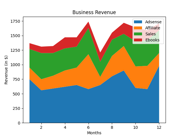
symmetrical stack plot
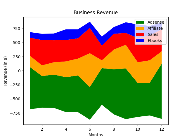
When baseline=”sym” is used
import matplotlib.pyplot as plot
import numpy as np

months= [x for x in range(1,13)]

#create data set
Adsense = [750, 560, 590, 620, 650, 580,
           650, 800, 900, 600, 580, 980]
Affiliate = [200, 190, 220, 280, 300, 600,
        140, 350, 420, 370, 400, 220]
Sales = [320, 450, 390, 380, 360, 450,
           260, 280, 210, 430, 440, 390]
Ebooks = [100, 110, 120, 190, 160, 110,
             160, 120, 190, 240, 170, 120]
revenue = [Adsense, Affiliate, Sales, Ebooks]

fig, ax = plot.subplots()
ax.set_title("Business Revenue")
ax.set_xlabel("Months")
ax.set_ylabel("Revenue (in $)")

#draw stack plot
col = ['green', 'orange', 'red', 'blue']
ax.stackplot(months, revenue, colors=col, baseline="sym")
ax.legend(["Adsense", "Affiliate", "Sales", "Ebooks"])

plot.show()
This displayed the following